Paroli-themes
From Openmoko
m (→Design concept 1) |
(→Design concept 2) |
||
| Line 26: | Line 26: | ||
== Design concept 2 == | == Design concept 2 == | ||
| + | * Designer: Warren Baird - wjbaird@alumni.uwaterloo.ca | ||
| + | * Screenshots/mockups: see right [[Image:Wjb paroli sms mockup.png|thumb|right]] | ||
| + | * Explanation:I've finally spent some time (when I should have been sleeping) and put together a rather rough mockup showing a bit of how I'd like to see the Paroli UI looking. I'm not sure how great a reception this'll get, since I there seems to be a minimalist trend in the current Paroli design. But frankly, I didn't buy a device with a nice 640x480 display to have a monochrome UI!! ;-) Few comments on what I did: | ||
| + | |||
| + | **fired up the gimp -- I definitely don't have time to figure out how to do all this stuff in edje, I'm afraid... | ||
| + | ** stole liberally from the Tango icon set. | ||
| + | **Added actual button-like images behind the buttons | ||
| + | ** adjusted the SMS display into a 'conversational' mode where all recent messages to and from a specific person are grouped together. | ||
| + | |||
| + | |||
| + | == Design concept Template == | ||
* Designer: | * Designer: | ||
* Screenshots/mockups: | * Screenshots/mockups: | ||
Latest revision as of 14:56, 17 June 2009
This page is here to collect the ideas, design mockups and thoughts about how Paroli could look like, how could it work. The plan is to create a new template to be used instead of the default black-and-white one.
For motivation, have a look at the Community driven redesign / new theme for Paroli thread
Contents |
[edit] GUI wishlist aka. Random ideas
- SMS writing in landscape mode: one small line for text and HUGE keyboard to be used with your fingers while walking
- Bling bling - what kind of effects do we have available? Fading, sliding..? I'd like to see it smoooth.
[edit] Design concept 1
Designer:pike 19:42, 6 June 2009 (UTC)
Explanation:


I love the black-and-white Paroli GUI, dubbed "Boring at Best" by someone in the mailinglist. It just needs tweeking; font sizes, alignments; it needs a few more concepts outlined - and it needs a sizzle - it should come alive when you start touching it.
To prove myself it could really look nice, I did these mockups. I'm not sure what to do with them; I have similar sketches in mind (and on paper) for a settings and a texteditor screen; and some style guidelines too ..
[edit] Design concept 2
- Designer: Warren Baird - wjbaird@alumni.uwaterloo.ca
- Screenshots/mockups: see right
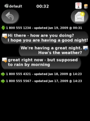

- Explanation:I've finally spent some time (when I should have been sleeping) and put together a rather rough mockup showing a bit of how I'd like to see the Paroli UI looking. I'm not sure how great a reception this'll get, since I there seems to be a minimalist trend in the current Paroli design. But frankly, I didn't buy a device with a nice 640x480 display to have a monochrome UI!! ;-) Few comments on what I did:

- fired up the gimp -- I definitely don't have time to figure out how to do all this stuff in edje, I'm afraid...
- stole liberally from the Tango icon set.
- Added actual button-like images behind the buttons
- adjusted the SMS display into a 'conversational' mode where all recent messages to and from a specific person are grouped together.
[edit] Design concept Template
- Designer:
- Screenshots/mockups:
- Explanation: